The Danish brand reinvents its most iconic design with new colours, more organic shapes, and solutions designed for a warmer, more sophisticated and emotional home
For years, pure white has defined the aesthetics of the contemporary kitchen. However, interior design is evolving towards a new sensitivity in which warm tones, harmony, and natural materials are taking centre stage.
In this context, colour is no longer merely an aesthetic choice but a tool capable of influencing the perception of space, light, and the sense of wellbeing in the home.
This vision is part of the essence of Danish design, a philosophy that sees the home as a space designed to improve everyday life through functionality, simplicity, and visual harmony. Clean lines, natural light, honest materials, and a constant pursuit of balance define an approach to design in which every element serves a purpose and contributes to creating calmer, warmer, and more liveable environments.
Mano, an icon of contemporary Danish design
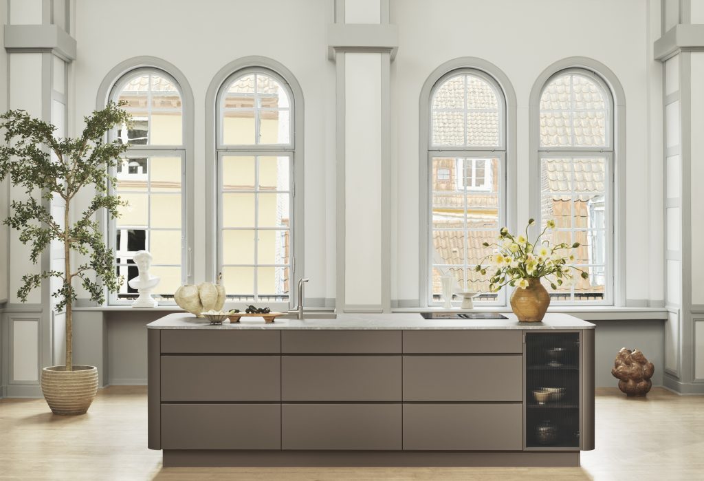
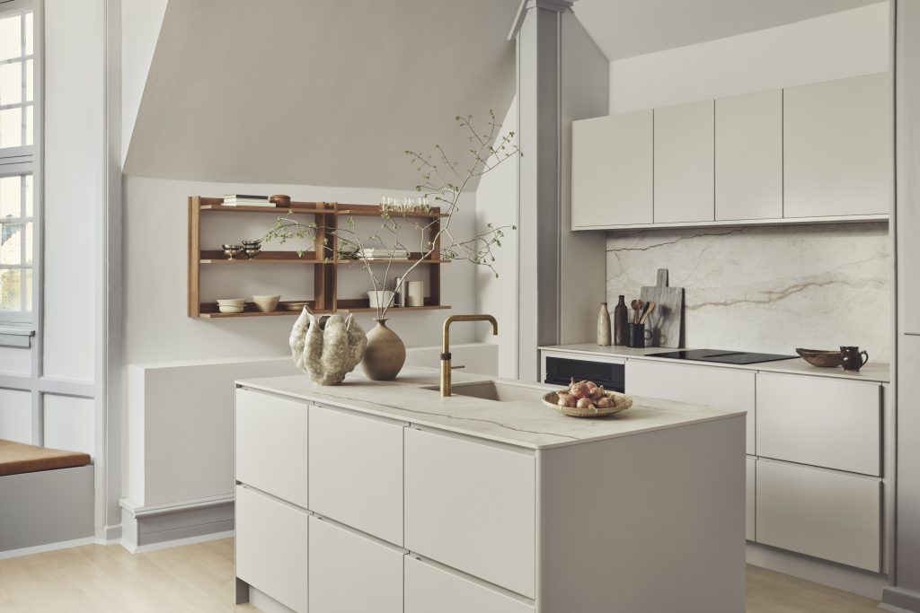
With this vision in mind, Kvik presents two new tones for Mano, its most iconic series: Crema and Mocha. Two warm and timeless colours that reinterpret contemporary Danish design from a softer, more enveloping, and human perspective.
The official presentation takes place during 3daysofdesign, the major international showcase of Danish design held in Copenhagen, where Kvik once again presents its vision of accessible, functional, and emotional design.
Designed 22 years ago and still one of Kvik’s most iconic designs, Mano perfectly embodies the principles of Danish design: functionality, simplicity, and durability, with a human touch. Its characteristic integrated handles, designed to fit perfectly in the hand, create clean, architectural lines that have made the collection a timeless reference.
Now, the introduction of these two new tones brings a new emotional dimension to the design, from a more warm, natural, and sensorial perspective. Both colours have been conceived to integrate with natural materials, especially wood and organically inspired stone, allowing for versatile and highly architectural configurations.
“In Kvik, we understand design as a living thing, capable of evolving in step with new ways of living. Today we see a clear trend towards warmer, more organic, and more personal interiors, where functionality coexists with emotional wellbeing. With the new Mano tones, we evolve our offering to this contemporary sensitivity while remaining true to the essence of Danish design: simplicity, beauty, and accessible functionality. These colours are contemporary… but also long lasting”, explains Helle Bjerre Drost, Senior Concept Manager at Kvik.
Crema introduces a soft, almost-white tone that takes the edge off pure white, replacing it with something calmer, more lived-in and more serene. It softens the space and enhances the sense of calm, while maintaining a timeless versatility that combines with wood and other natural materials across different kitchen styles in the contemporary home.
Mocha: depth and natural connection
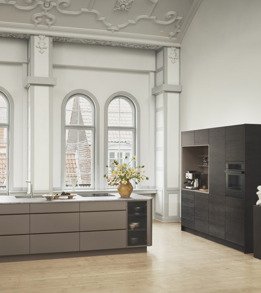
Mocha is deeper and warmer, a brown that feels inviting rather than heavy. It brings depth to a space, while adding a sense of comfort and grounding. A colour designed to create enveloping interiors with a more tactile and emotional quality, pairing naturally with wood, stone, and organic materials.
New details that soften the design
Mano was already available with a rounded corner version, which is now also available in the new Crema and Mocha colours, reinforcing its softer and more organic character.
In addition, new end panels with rounded edges are introduced, expanding the design language and enhancing the sense of visual continuity throughout the kitchen.
These softer geometries bring a more human and welcoming dimension to the design, strengthening the fluid aesthetic that defines Mano’s architectural language.
The new crema and mocha tones are also applied to bathroom and utility room solutions, extending Mano’s design language beyond the kitchen and reinforcing a continuous aesthetic across the contemporary home.
In addition, beyond colour, the evolution of Mano incorporates new design solutions that enhance both the aesthetic and functional experience of the collection: integrated display cabinets, coffee stations, and X-module door fronts.
True to the philosophy of Danish design, Mano evolves without losing its essence: creating functional, beautiful, and timeless spaces.
The introduction of Crema and Mocha responds to a more warm and conscious way of living, where colour, materials, and light work together to enhance the everyday home experience.
About Kvik
Since 1983, Kvik has been creating ‘kitchens with good intentions’. In fact, it was Kvik that coined the term SamtaleKøkken® in the late 1990s. A Kvik kitchen invites you to come together, to spend time with one another, and to share and enjoy experiences together. And by kitchen, we don’t just mean the kitchen itself, but the whole room, the whole universe. That is why, in addition to its 15 kitchen ranges, Kvik also offers the Kvik Living furniture and design collection. It comprises interiors that match and complement the kitchens – modern, timeless and simple, inspired by classic Danish design, but interpreted within a modern context.
Kvik is part of Ballingslöv Int. AB, one of the leading kitchen and bathroom groups in Scandinavia and the UK. The Danish brand operates more than 160 stores in 13 countries through an exclusive franchise network and is currently undergoing international expansion.
More resources: https://www.kvik.es/acerca-de-kvik/prensa